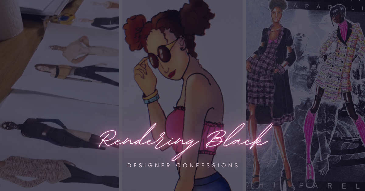
I’ve always been fascinated by dark skin tones and deep complexions, especially in art.
It’s one of the hardest things to render, especially in fashion illustration. Choosing the right media can be daunting, and correcting the ‘ashy’ tones most markers tend to produce can be frustrating if you don’t know how to apply shadows and lighting.
A true fashion illustrator takes their time to master dark skin tones, but the techniques don’t come overnight.

2011: An illustration of my first attempt at rendering dark skin tone.
Media Used: Crayola Colored Pencils
It took me years to master the art of making the darkest skin tone look as natural as I could possibly get it. However, my journey began with colored pencils.
I dreaded picking up the darkest colored pencil I had, afraid my illustrations would look ‘washed out’ and—hear it comes—‘ugly’. I was afraid that a darker complexion would make my figures hideous and unreadable.

2017: My very first attempt at marker rendering done when began to attend FITNYC.
But that mentality stemmed from the fear of breaking away from the accepted status quo. You look around and see that most fashion illustrations rendered Caucasian girls.
My fear birthed determination. I was determined to include every skin type and color I could possibly think of. My message: “All girls are welcome.”
I picked up my colored pencils and began to practice.


Illustration comparison between 2016 (left) and 2017 (right). Media Used: Prismacolor Colored Pencils
Fast forward a few years later, when I’m in FITNYC and now working with markers. Seeing Caucasian women have a better grasp and understanding of rendering darker skin tones crippled me.
Not many Black students understood or even wanted to do it. And if they did, they never cared to master it. Their illustrations became washed out and unreadable.
When it comes to darker complexions, diligence matters. Undertone matters. The message matters.

Side by side comparison of a 2015 (left) and a 2016 (right) illustration. Media Used: Prismacolor Colored Pencils
No one was going to refuse me the right to illustrate dark complexions. And no Caucasian college mate of mine was going to do it better than me. So I picked up my markers and practiced.
Mixed media, different strokes, and different techniques, I applied everything I learned to illustrate a beautiful Black woman.
How hard was it? Probably hard enough to give me an ‘almost’ breakdown, but not so hard that I willingly gave up. I decided that I needed the perfect opportunity to practice shades of Black. What better way to do it than with my Ancient Egyptian project?


2018: My handling of dark skin tones really shined during my Fashion History class, when I completed an assignment inspired by Ancient Egypt. Media Used: Prismacolor alcohol markers, Copic Sketch alcohol markers, pan pastels, Prismacolor colored pencils, white gel pen, gold gel pen
Six figures stood before me.
All of them representing Black women. From the lightest to the darkest. All of them Black, bold, and beautiful.

Signed,

About

Written by R. ‘Nickay’ Headlam
Nickay is a writer and designer who grew up in the British Virgin Islands. Her passion for art, design, and writing grew into a blog, now called The RAVYN Blog, where she writes about her Christian journey, theology, current events, art and design, and fashion.

Build your business and answer your calling with my weekly tips to help you grow.
Reblog This:











Leave a Reply